
31/07/2012 – 01/09/2012
Examining why we live in a certain place can bring about a range of responses from practical to emotional; from love to indifference and from dream to fulfillment.
To almost be able to see something implies a sense of disappointment; a partial realization of a dream. The irony in the exhibition title reflects the concept of not quite attaining a desire and this relates to a question of identity with Plymouth as a hometown and acts as a metaphor for a desire to live elsewhere.
Works shown in the exhibition included:
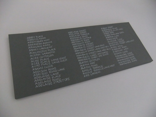
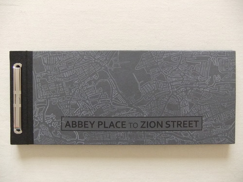
Abbey Place to Zion Street, 2011
A handmade book 297 x 120 x 13mm, recycled paper, card, buckram, ink, carbon paper
The task of handwriting a list of all the street names in Plymouth is a metaphor for duration, reflecting the length of time lived in one place. The use of handwritten text provides a sense of personal emotion, linked here, to a specific place. Duration and emotion can be interpreted with either a positive or negative response from the viewer.
49 Minutes, 2012
A handmade book 148 x 210mm, tracing paper, ink
The use of repetitive text suggests a sense of everyday sameness, implying that time has been spent too long in one place. Tracing paper offers a tactile quality, giving glimpses of what lies ahead
Redaction/Response, 2012
Two handmade books 290 x 355mm, newspaper, cartridge paper, ink, bulldog clips
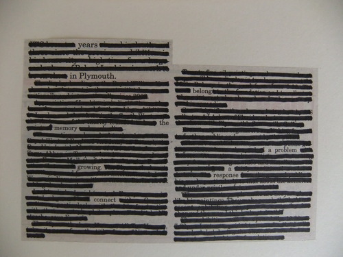
Redacting the text from various Plymouth Herald newspaper articles, left a series of poems, which tell a story of a response to thirty years of living in Plymouth.
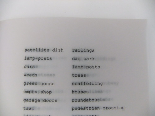
Ten Views, 2012
A4, blotting paper, flour and water paste, watercolour paint, paper, ink.
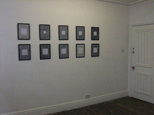
The impersonal descriptions of Ten Views suggest a bland suburban environment; one that could be anywhere and insinuates a distance from the sea. A personal aspect is virtually ignored, despite the views being from the artist’s home.
All Other Routes/Road Closed/Diverted Traffic 2012
59.5 x 84cm (A1 unframed) cartridge paper, carbon paper.
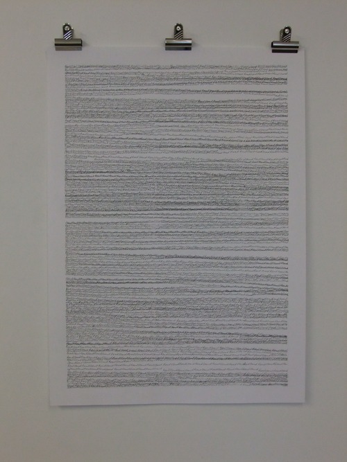
Repetitive text, hand- written on carbon paper has a spatial quality that, when viewed from a distance, suggests horizon lines or an abstract image of the sea, acting as a metaphor for distance and space. Viewed more closely, the viewer is presented with legible text taken from local street signs.
About Clare Rogers
Clare qualified as a graphic designer in 1986 and the influence of text in her work remains paramount. In 2011 she graduated from Plymouth University with a first class honors degree in Fine Art. Clare is interested in the use of repetitive text, list making and, more recently, writing exercises involving direct responses to places, objects, scents and feelings. She produces 2D works as well as handmade books using a variety of papers and predominantly uses ink, pencil, carbon paper and paint.